How to use SVG to create spinner in Power Apps
How to use SVG to create spinner in Power Apps
How to use SVG to create spinner in Power Apps will be a demonstration of an alternative to GIF spinners.
The spinner (of any shape) is a great way to show Users that they need to wait as something is processed in your Power Apps.
One way is to use loading.io and generate the GIF but I think there is a better way 😀 In this post I will show How to use SVG to create spinner in Power Apps.
With SVG I can have control over generate spinner and make it easy to adjust it to for many Applications:

NOTE: I will do it as baby-steps to show the thinking process but will also share the fully functional version of the App & Components with all 3 types of Spinners 🤯
Table of content:
- 1 – Generate SVG
- 2 – Add SVG to Power Apps
- 3 – Customization of SVG via controls
- 4 – Customize of SVG via variable
- 5 – Customize of SVG as Component
- Other types of SVG spinners
- How to use in Apps
- Downloadable resources
- Summary
1 – Generate SVG
I know that there are other ways but let’s keep it simple and easy, so as the first example will use Eclipse.
Firstly, I go to loading.io, selecting Eclipse type and adding a little bit of configuration:
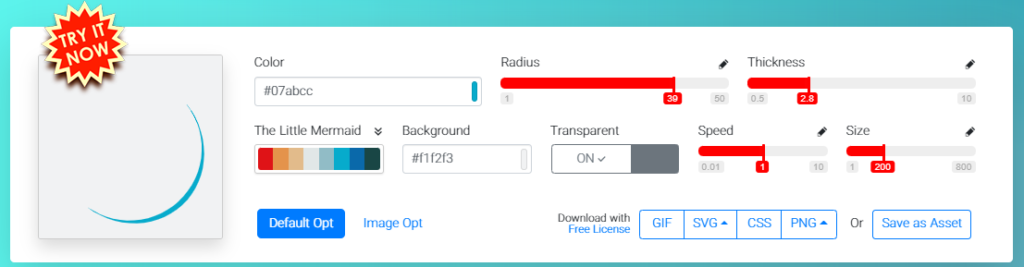
I can control settings like color, radius, thickness etc.
When I’m happy with the result as the Download option I selected SVG. It is downloading the file which I can open with any text editor (used Visual Studio Code):
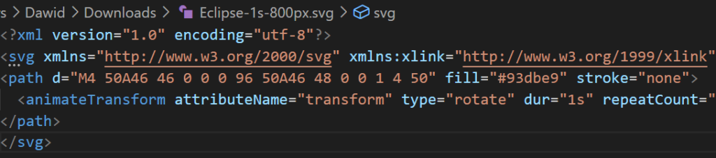
<?xml version='1.0' encoding='utf-8'?>
<svg xmlns='http://www.w3.org/2000/svg' xmlns:xlink='http://www.w3.org/1999/xlink' style='margin: auto; background: rgb(241, 242, 243); display: block; shape-rendering: auto;' width='800px' height='800px' viewBox='0 0 100 100' preserveAspectRatio='xMidYMid'>
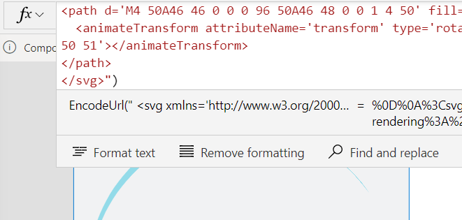
<path d='M4 50A46 46 0 0 0 96 50A46 48 0 0 1 4 50' fill='#93dbe9' stroke='none'>
<animateTransform attributeName='transform' type='rotate' dur='1s' repeatCount='indefinite' keyTimes='0;1' values='0 50 51;360 50 51'></animateTransform>
</path>
</svg>2 – Add SVG to Power Apps
My first though it was to add SVG code to HTML control. But that did not work for me 😥 I decided to search for the answer and came a cross this nice blog: Using SVG in Powerapps | Summit Bajracharya
I had the idea what to do next but based on experimenting I would suggest to do following:
- Add Image control to the canvas
- As the Image property, insert the code of the SVG
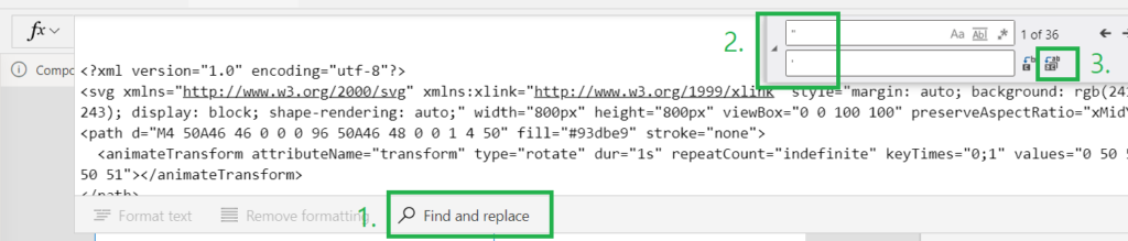
- Use option of Find and replace
- Click from formula bar Find and replace
- Click toggle replace mode and add ” character in find box, ad ‘ character in replace box
- Run Replace all (Ctrl + Alt + Enter)
- Remove first line of code:
<?xml version="1.0" encoding="utf-8"?>- Add data:image code before <svg> tag:
"data:image/svg+xml;utf8, " & EncodeUrl("The result should look as follows:
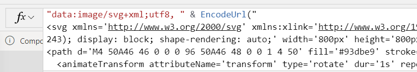
- After </svg> add “):
If you did everything correctly, you should already see the Eclipse working in image control 😍
3 – Customization of SVG via controls
My idea for this step is to add a set of the controls which will affect the display of the Eclipse.
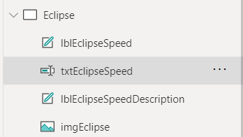
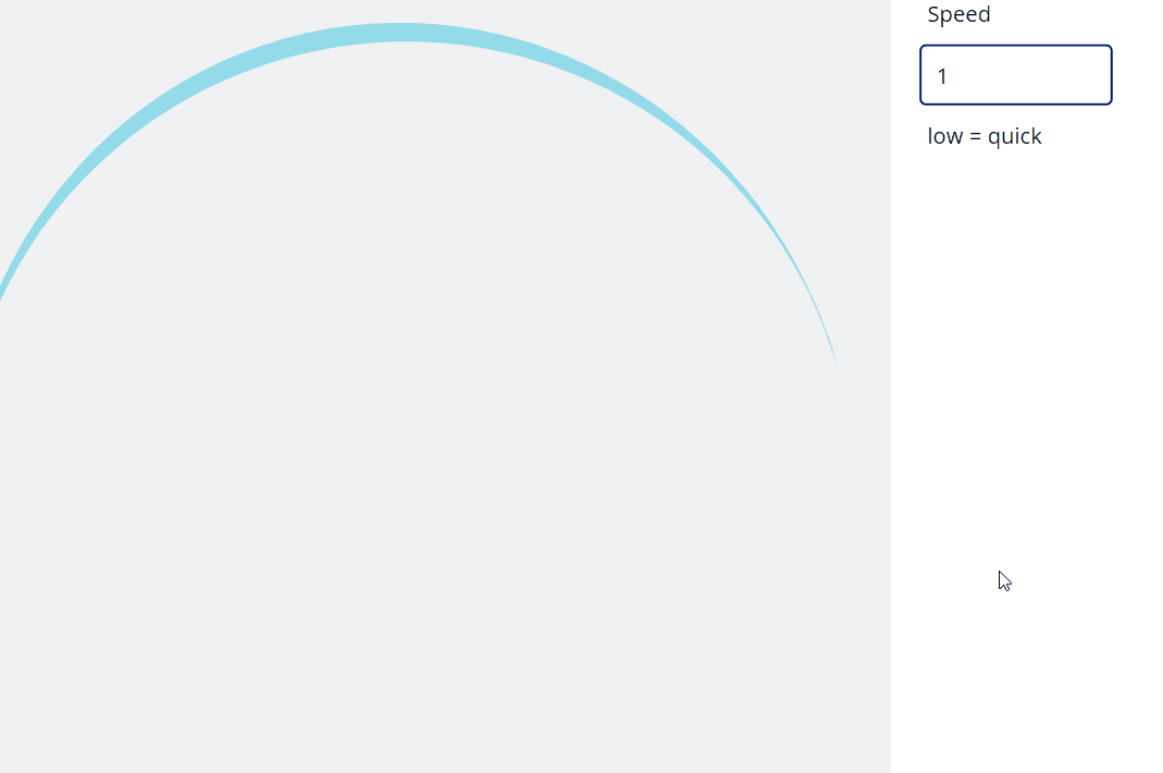
I will start with speed of the Eclipse. I’m adding two labels and one text input controls to canvas:
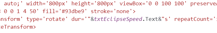
Next in the Image property I’m looking into the SVG code, I want to find dur=’1s’:
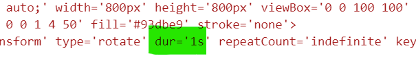
And I’m replacing the 1 value with:
"&txtEclipseSpeed.Text&"Basically, I’m inserting into static text dynamic value from Power Apps:
Result is:
Of course, the description label may be more meaningful for you 😋
That can be repeated for other properties of SVG also. I will not try to alter everything, will be happy with the:
- Size
- Background
- Color
Size property
I decided to make it based on the size of the control, so changed:
width='800px' height='800px'to:
width='"&Self.Width&"px' height='"&Self.Height&"px'Background property
Background thou it is added as the RGB it also works with RGBA which very useful if I would like to create transparent version.
For background control, I added the next set of controls (2 labels, 1 text input):
- lblEclipseBackground
- lblEclipseBackgroundDescription
- txtEclipseBackground
In the SVG code found:
background: rgb(241, 242, 243);And I changed it to:
background: rgb("&txtEclipseBackground.Text&");Color (fill) property
I was surprised that Color (fill) is in the Hex, to understand this part better I need to learn more…
Color (fill) property will be manage via next set of the controls:
- lblEclipseColor
- lblEclipseColorDescription
- txtEclipseColor
I want to change default:
fill='#93dbe9'to:
fill='"&txtEclipseColor.Text&"'With that via controls in Canvas I can control how the Eclipse looks like.
4 – Customize of SVG via variable
After playing with the Eclipse via controls, I started to think that the same result can be achieved if I will use record variable, which will keep details of SVG configuration.
Creating variable
I will now create a variable which will keep my configuration details:
UpdateContext(
    {
        _vForEclipse: {
            Background: "55,55,255,0",
            Color: "#7ff1e0",
            Speed: "0.8"
        }
    }
)
I’m using UpdateContext as I work only with this variable in one screen. Additionally, based on my experience, it is easier to maintain app with lesser amount of global variables (create via Set function)
Update SVG code
Next step for me it st add the context of the variable to the SVG code:
"data:image/svg+xml;utf8, "&EncodeUrl("
<svg xmlns='http://www.w3.org/2000/svg' xmlns:xlink='http://www.w3.org/1999/xlink' style='margin: auto; background: rgb("&_vForEclipse.Background&"); display: block; shape-rendering: auto;' width='"&Self.Width&"px' height='"&Self.Height&"px' viewBox='0 0 100 100' preserveAspectRatio='xMidYMid'>
<path d='M4 50A46 46 0 0 0 96 50A46 48 0 0 1 4 50' fill='"&_vForEclipse.Color&"' stroke='none'>
  <animateTransform attributeName='transform' type='rotate' dur='"&_vForEclipse.Speed&"s' repeatCount='indefinite' keyTimes='0;1' values='0 50 51;360 50 51'></animateTransform>
</path>
</svg>")
What I did here is replacement of the dynamic values taken from controls to the variable data.
Ok, but the Context variable will work only for one screen I could next create global variable and achieve very similar result, but there is a better way, component.
5 – Customize of SVG as Component
Component is reusable building blocks of the Power Apps Canvas applications, if you can learn more start with: Create a component for canvas apps (contains video) – Power Apps | Microsoft Docs
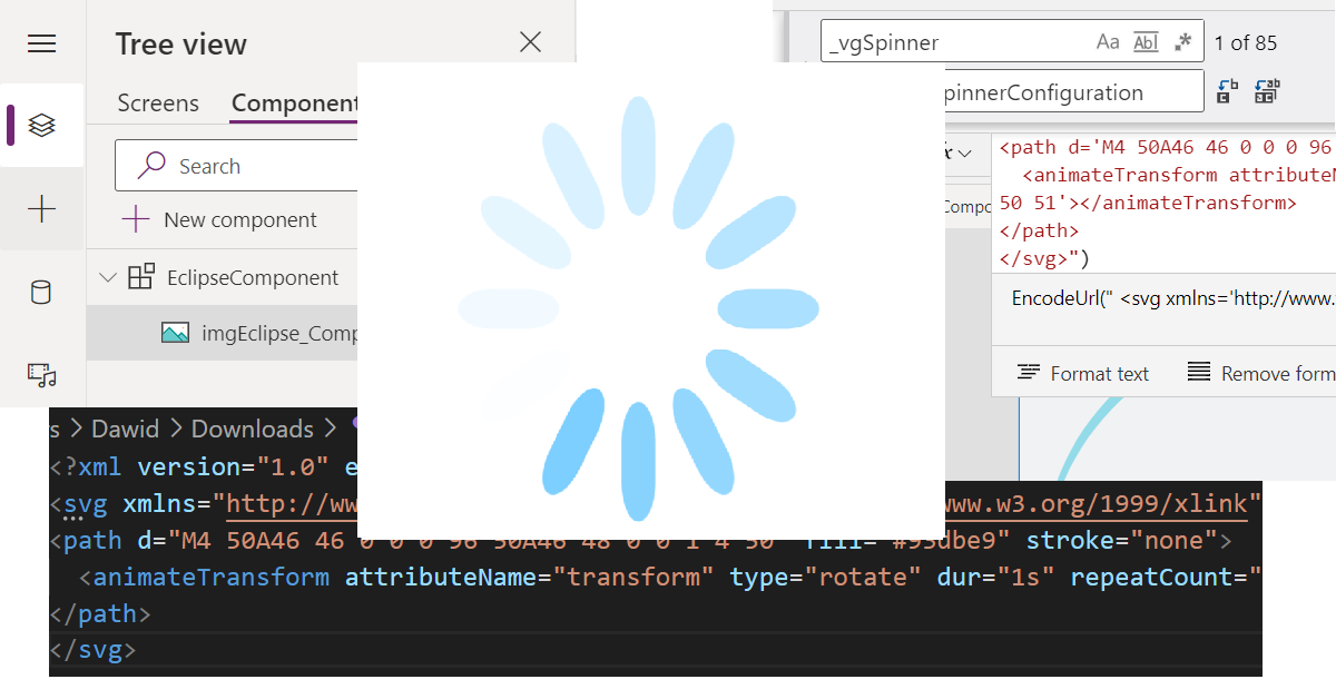
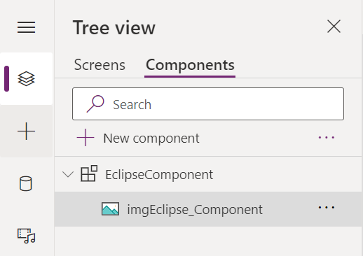
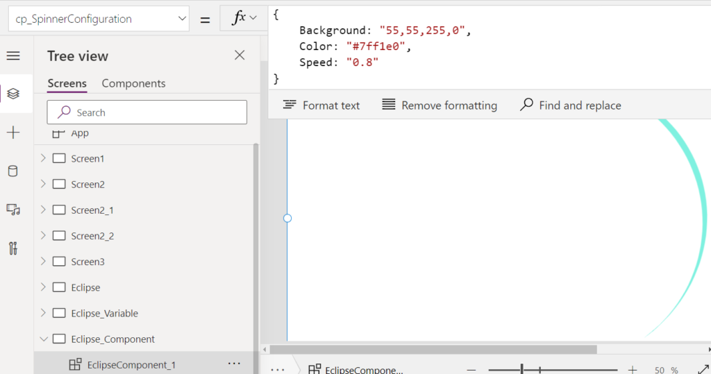
In the Power Apps designer, I changed to the Components and created new component EclipseComponent. Added to it only the Image control:
I set the EclipseComponent Width and Height to the App.Width and App.Height. Next for imgEclipse_Component control Width & Height, I set Parent.Width and Parent.Height. With that done, I’m sure that Component and Image in it will display on the whole Screen.
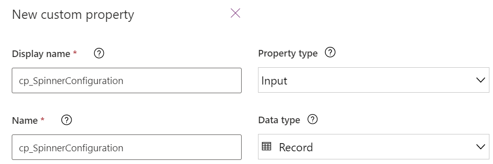
I will now add custom property (cp_SpinnerConfiguration) of the record type:
To make the next steps of the configuration easier, I will add the “dummy” values to the custom property:
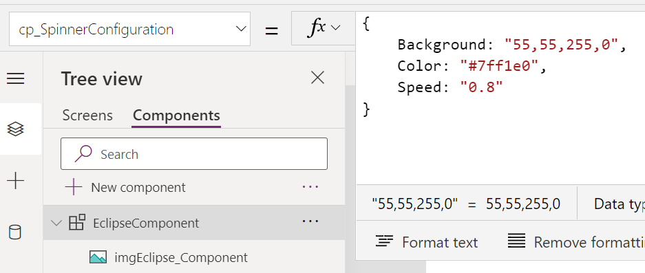
{
    Background: "55,55,255,0",
    Color: "#7ff1e0",
    Speed: "0.8"
}
The finishing touch is to update the SVG code to refer to the custom property and values from it:
"data:image/svg+xml;utf8, "&EncodeUrl("
<svg xmlns='http://www.w3.org/2000/svg' xmlns:xlink='http://www.w3.org/1999/xlink' style='margin: auto; background: rgb("&Parent.cp_SpinnerConfiguration.Background&"); display: block; shape-rendering: auto;' width='"&Self.Width&"px' height='"&Self.Height&"px' viewBox='0 0 100 100' preserveAspectRatio='xMidYMid'>
<path d='M4 50A46 46 0 0 0 96 50A46 48 0 0 1 4 50' fill='"&Parent.cp_SpinnerConfiguration.Color&"' stroke='none'>
  <animateTransform attributeName='transform' type='rotate' dur='"&Parent.cp_SpinnerConfiguration.Speed&"s' repeatCount='indefinite' keyTimes='0;1' values='0 50 51;360 50 51'></animateTransform>
</path>
</svg>")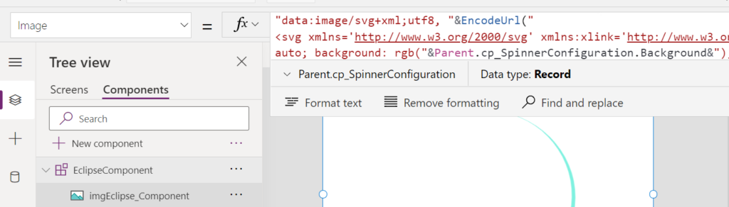
Now I’m ready to reuse the component. In every Screen where I will add EclipseComponent I can either keep the default configuration or overwrite the custom property cp_SpinnerConfiguration value.
Component library
The next level and the easiest way to share the component is to utilize the Component library. Basically with the Component library you can create assets which can be reused by the whole company.
If you want to learn how to work with Component Library, check out the following blog post: Make A Power Apps Component Library To Share And Reuse Components (matthewdevaney.com)
Other types of SVG spinners
The Eclipse was the first type with which I wanted to describe. I would like to share here two more types, but I will save the whole journey and just show ready to use Components 😁
SVG Rolling type
First additional one is Rolling type which is very similar to the Eclipse. The diffrence is in the number of the properties, for it I added radius and thickness.
Default definition of the component variable:
{
    Background: "55,55,255,0",
    Color: "#7ff1e0",
    Speed: "1",
    Radius: "42",
    Thickness: "6"
}
Result:

SVG Spinner type
Second and final in this post will be Spinner. It is the one with which I started to experiment. But the SVG code was totally different. When I was doing change, I need to replace variable reference 85 times !
I started to think that Spinner could discourage Readers because of the complexity level 😰 that is why decided to start with a much simpler example. 😁 But still wanted to keep the title of the post: How to use SVG to create spinner in Power Apps to keep the true hero in the spot light 😋
Spinner component default record:
{RX:6,
RY:6,
Height:18,
Width:6,
X:47,
Y:18,
Fill:"#71cbfe",
Background:"255,255,255,0"}
Quick explanation of the properties:
- RX / RY will make the edge of the spinner bar more curved
- Height affects the bar height
- Width also affect the bar but width
- X it is like an axis of the bar – suggest to play with it 😉
- Y the location from the center of spinner
- Fill / Background nothing new
Now I’m happy and almost can start to share good news.
How to use in Apps
Yet, before speaking / writing about the resources, I would like to make sure that everyone can know how to use the Spinners. Idea is simple.
- Add component to the canvas.
- Change the Visible property of Component to the boolean (true/false) variable. (I would personally use Contextual type as it is working on a single screen).
- For every action where you are submitting / reading / deleting the data, add at the beginning update of variable to true in order to display Spinner Component. At the end of all operations, change variable to false.
Example:
//Display spinner
UpdateContext({_vShowSpinner:true});
//Data operations
Patch(Orders,Defaults(Orders),{Title:"Demo"});

//Hide spinner
UpdateContext({_vShowSpinner:false});
Keep in mind error handling when you are with data.
Downloadable resources
As I initially promised, I’m sharing all described resources:
First resource is the sample App where I added 3 screens for each type of spinner showing the progression, from controls, to variables and finally components.
Three other resources are the Components which can be added to the Component Library. How to work with Component Library, you can check here: Make A Power Apps Component Library To Share And Reuse Components (matthewdevaney.com)
Summary
I had a lot of fun writing this blog, and I hope that How to use SVG to create spinner in Power Apps will be as useful as I had fun with it.
I know that in How to use SVG to create spinner in Power Apps I did not cover all the possible manipulations which can be done with SVG’s, but I really struggle with balancing the complexity level of this post. If you want to learn more, feel free to let me know, and I will try to address your queries.
I strongly think that presented SVG spinner in Power Apps will help you to develop more User friendly Applications with better UX. In the next post, I’m planning to show how to add a couple adjustments to the whole idea.
Last but not least if you manage to read the whole post thank you very much, and I hope the content will be useful for you.
Have a great day.
One thought on “How to use SVG to create spinner in Power Apps”